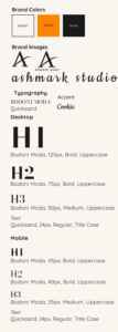
I built this brand in Figma and set a simple palette. Charcoal and cream carry the base and keep contrast strong without the glare of pure white against pure black. People with eye strain, including folks with glaucoma, report discomfort with that pair, so I avoid it. Orange is the accent, adding lift to links, buttons, and small calls to action.
Type sets the tone for the site. Bodoni Moda is used in the headlines and sets a print feel. Quicksand handles body text and interface copy. The mix nods to magazines and newspapers. Cookie works as a small accent for the icon and footer. Elementor Pro will not render Cookie in live view, so I exported those bits as images.